As the U.S. unemployment (U3) rate slowly approaches 4% (not seen since December 2000 at 3.9% or November 1968 at 3.4%) and with the addition of another 209,000 jobs in July 2017, central bankers and economists are wondering when we will see a rise in inflation (June CPI at 1.6% and July PCE at 1.4%). Classic labor economists look to A.W. Phillips’ curve for answers. This reminds me of people “patiently” waiting for the groundhog to emerge from its burrow each year to learn if spring will come soon.
Phillips Curve
In 1958, A.W. Phillips published his observation of UK historical wage data in the London Business School publication, Economica[1]. Phillips noted an inverse relationship between the “change of wage rates” and unemployment (“Phillips Curve”). When the demand for labor grows during periods of increased business activities, unemployment shrinks and which ultimately leads to higher wage rates to retain or recruit workers. Vice versa is also true even though the relationship between unemployment and wage rates is highly non-linear due to behavior biases and time lag. Phillips’ paper does not equate “change in wage rates” to inflation. Since then, the Phillips Curve has been highjacked or morphed into a relationship between unemployment and inflation. The idea being that, during periods of economic expansion, the unemployment rate drops and wages rise (i.e. change in wage rates) which increases demand that leads to inflation.
The binary relationship seems intuitive with a predictable negative correlation (yellow line in the left graph) over time. However, using 1950 through June 2017 unemployment (U3) and inflation (CPI) data, the relationship is not obvious (blue dots). What can be said is that a large cluster of 4% to 6% U3 data periods gave us CPI readings between 1% and 5%.
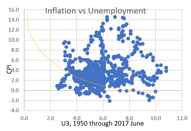
Phillips’ research was based on 1861 to 1957 UK labor data. This data is over a century old when the world economy was less connected. Also, the U.K. and the U.S. are very different countries since this period. After all, inflation (supply and demand driven) cannot be explained by labor tightness/wages alone.
The following graph shows the relationship between US and CPI since January 2007. With the exception of the negative correlation during the Global Financial Crisis/Great Recession period, the data shows that, as the U3 rate continues to march lower, CPI remains range bound to slightly trending downward.
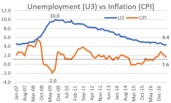
Recently, when these two variables are plotted, the relationship is not inverse. Instead, the Phillips Curve flattens. This means that we are going through a positively correlated period where inflation and unemployment rates are both low. Inversely, during the 70’s, inflation and unemployment rates were both high (stagflation period) which led to a flattening of the curve as well.
The Federal Reserve and many academics continue to be puzzled by the lack of meaningful wage and general inflation with U3 at or around NAIRU. Although the intuitive relationship expressed in the Phillips Curve remains sensible, it obviously does not explain the current positive correlation between U3 and CPI.
The Federal Reserve (“Fed”) and the European Central Bank (“ECB”)
Since the now famous Bernanke “Taper Tantrum”, the Fed is considered “well on its way” to normalize rates and now, after repeated guidance, is readying its balance sheet normalization to begin next month. The forward-looking consumer and business sentiments have significantly tempered since the Trump election, and with each passing day, the likelihood of any major tax reform or fiscal stimulus legislation passing this year continues to wane. The market has moved from being almost certain of the proposed third rate increase by the end of this year to about 50%. This is not because the economy is failing; it is just that the economy is breaking out of its 2% range with the inflation rate turning down. So far, the Fed can point to the significant improvements in the labor market as meeting one of its dual mandates, but price stability of targeting a 2% inflation rate has been much more challenging.
President Mario Draghi of the ECB gave an upbeat economic summary about the euro area during his speech on June 7th at Sintra, Portugal. When coupled with the continuing expansion in the euro area, the market is now expecting ECB normalization. ECB is likely to stop its large-scale asset purchases first before rate normalization. Unlike the Fed, ECB’s sole mandate is price stability targeting an inflation rate just below 2%. What we worry about is the synchronized normalization of monetary policies going forward and the increased probability of a policy mistake.
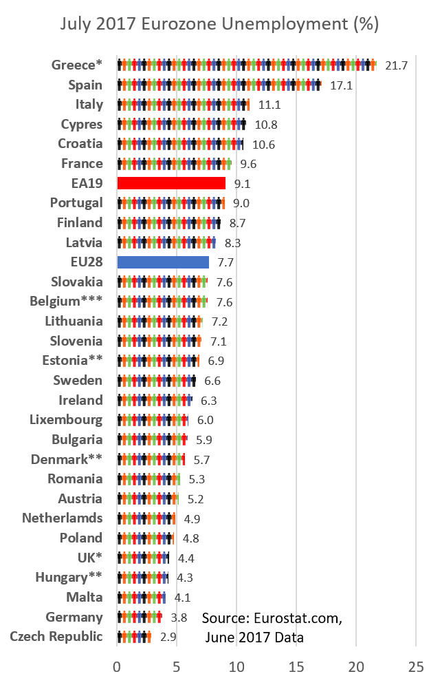
Unemployment continues to improve in the euro area as well as the U.S. This graph shows the June 2017 unemployment rate for each country in the euro area with the countries under EMU (i.e. EA19) averaging at 9.1% while the larger euro area (i.e. EA28) is averaging 7.7%. Except for the four worst hit economies during the Global Financial Crisis of Greece, Spain, Italy and Cypress, almost all remaining countries are at or below 10% unemployment. The poster child is Germany at 3.8% who has benefited significantly by the weak euro to drive its export driven economy.
With the improving euro area economy and the economies in emerging and developing markets, the unemployment rate should continue to move lower. In July 2017, the CPI was at 1.3%, far below the target.
In the U.S., the labor market has recovered faster and longer.
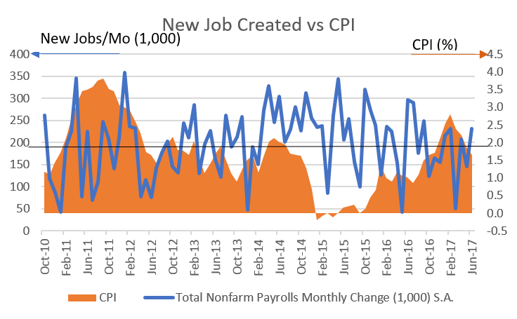
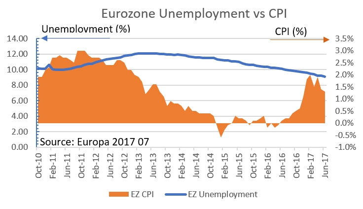
Since October 2010, the U.S. has continuously added new jobs monthly. As of July 2017, 16,244,000 jobs had been created in that time. After 30 quarters of economic expansion in the U.S., the average monthly new jobs created over the past 6 months is 179,000. The graph above shows the monthly new jobs created since October 2010 and the corresponding CPI. We are waiting for a sustainable 2% inflation target to return. The following graph shows an improving employment in the eurozone and inflation remaining solidly below 2% as well.
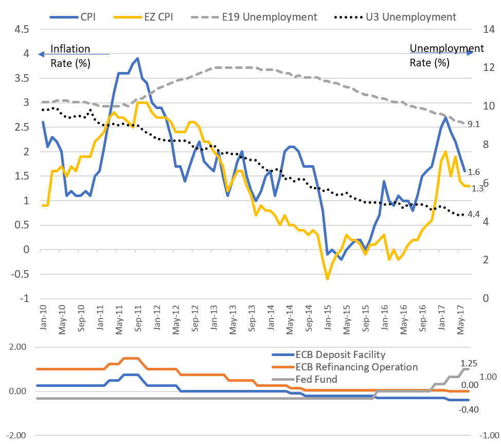
We combined the inflation and unemployment data from the eurozone and compared them to the U.S. CPI and U3. The graph shows a systematic and gradual improvement in employment. Disinflation and deflation seem to have given way to inflation and reflation since the low in January 2015, but in recent months we have witnessed a reversal and inflation is trending below the 2% target for both the Fed and the ECB. We also added the policy rates for the ECB and the Fed to show the hopefully delayed impact of unconventional monetary policies on inflation.
 With few exceptions, CPI has not breached the 2% level since the unemployment rate dropped from 10% to 4.3% today. This is totally in contrary to what the “updated” Phillips Curve would have expected. Perhaps the Phillips Curve is not broken but it is merely insufficient in being a predictor for policy.
Most central bankers believe the current missing inflation is due to transitory factors and that (they hope and pray) the targeted 2% inflation rate will be reached. The reality is more complex. Chair Yellen pointed to cellular phone rates being the culprit of the current low CPI. CPI is an aggregated rate of its consumption basket. With technological integration and global competition, it is not unusual to expect one-off or ongoing price adjustments of different components of the basket over time that drag down the CPI.
The battle of inflationary vs. disinflationary forces in the secular horizon and factors that cannot be explained or otherwise are not reflected in the simple Phillips Curve could make all of us wait for the sign of spring for some time to come!
[1] http://onlinelibrary.wiley.com/doi/10.1111/j.1468-0335.1958.tb00003.x/epdf